We’re one week away from Halloween, and I’m thinking about all things spooky and scary, including what’s frightening on a job board – bad mobile experiences.
I know, I know.
You know that job seekers search and browse jobs on their mobile devices. We’ve talked about it a lot here on the Careerleaf blog, and you’d have to have your head in the sand not to notice how many people use their mobile devices for just about everything.
But the reality of it, and how job boards are facing up to it, can be a frightening prospect. Below are a couple (anonymous) examples of what job search can be like on a phone.
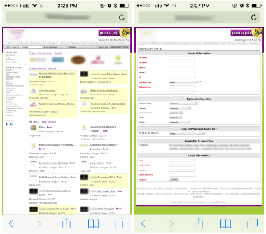
Classic Old School
This job board features a still-functional older design, but it’s intended only for desktops/laptops, and becomes unreadable on mobile without excessive zooming and scrolling. The point of registration for the job seeker isn’t any easier for the mobile user.
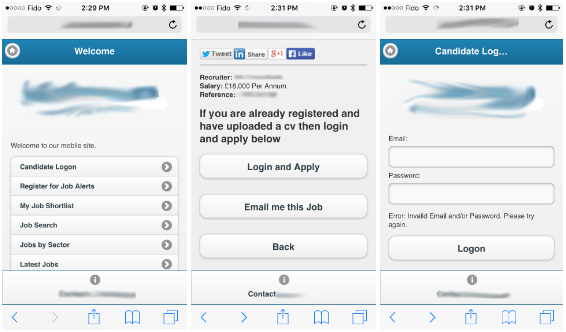
Separate Mobile Versions Left Wanting
It’s pretty standard to alter the look of content for the size of the web browser (and therefore accommodating mobile users), such as adjusting the size of text, reducing or hiding images, etc. Job boards that maintain separate mobile versions tend to create a very different look and feel than their desktop counterparts.
But it’s another thing altogether if the mobile version makes it difficult or confusing to do something like signing up. In the example below, the mobile version of the board gave me the ability to login and search and browse for jobs. However, there was no clear path to registering as a new user. The apply button assumes the job seeker already has an account.
There is the option to email the job to myself, and then sign up later on a desktop. But it means you’ve just interrupted the interaction, and the chances of the candidate following through and applying are lowered.
The mobile experiences seen above are disappointing because there are still so many organizations with job boards that haven’t yet moved to mobile, or whose mobile experience is significantly flawed.
That being said, it’s very encouraging that so many recruiting websites have identified mobile experience as a priority they want to tackle soon. We ran a small, informal poll on Twitter during the TA Tech event in September, and it is encouraging to see that mobile-friendly recruiting is a priority, even for those whose recruiting solutions are not yet mobile.
How many of you have yet to switch to a mobile-friendly recruiting platform? #TAtechVegas#TAtech#recruiting#jobboards
— Careerleaf (@Careerleaf) September 21, 2016
In gathering the screenshots used above, I discovered that many of the mobile-unfriendly job boards out there still have a lot going for them. In addition to their years of experience in the job board industry and the relationships they’ve built, they’ve developed messaging and services has connected with their market.
Where they will run into trouble is the point at which they will stop being the number one choice for their candidates and customers, who can easily find mobile-friendly solutions elsewhere in the form of newer or bigger competitors. Older job boards usually have established reputations, and offer unique value to their niche or region. When you combine that with easy, mobile-friendly user experiences, suddenly you really do have the power to compete with the “big guys”.
A lack of a mobile-friendly site will also impact their ability to turn up on search engines – especially on mobile devices. And that, in turn, will hurt the success that their customers have in finding candidates, and candidates finding their jobs.
Becoming a mobile-friendly job board doesn’t have to be a terrifying prospect. Yes, you’ll have to make some choices about user experience and design. It may even be the right time to update or re-think your business model. But not making the change or procrastinating to do so may mean risking obsolescence.
Are you scared of making the change to having a mobile-friendly job board? What’s holding you back? If you have challenges or perspectives you’d like to share, leave a comment or get in touch – don’t be scared!